
Every logo has a story…so what’s the story behind this one?
To tell you the truth, it sort of all came together like when Neo stared seeing the world as The Matrix: It just clicked. As a strategic designer, I prefer for things to have purpose, meaning, and a goal. My logo had to embody the essence of strategy, and it needed to be graphical. So, in brief, here is the imagery that inspired my logo:
It’s all strategy.
Checkers is a game of strategy. If you look at a checker piece as it moves across the board, this is what you might see.

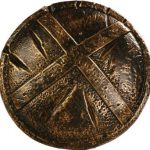
The Spartans, though they did not win the battle at Thermopylae, were some of the most strategic warriors in history. The actors in the movie 300 used this shield, and again, we see the circular and triangular shapes repeated.
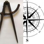
Finally, the tools of marine navigation and cartography: the Sargent Compass and compass rose. Those scurvy-slammed sailors didn’t just hop on a ship and set sail without a plan: “Yo-ho-ho and a bottle of Where The Heck Are We?”
Each of the above images references the final logo–and believe me, there were many, many iterations. I even trashed an entire idea (or two) and started over. Ultimately, I followed the KISS principle and chose to keep the graphic simple.