
This post is part of a series called Hypefaces, where we explore the history and evolution around popular (and not-so-popular) typefaces.
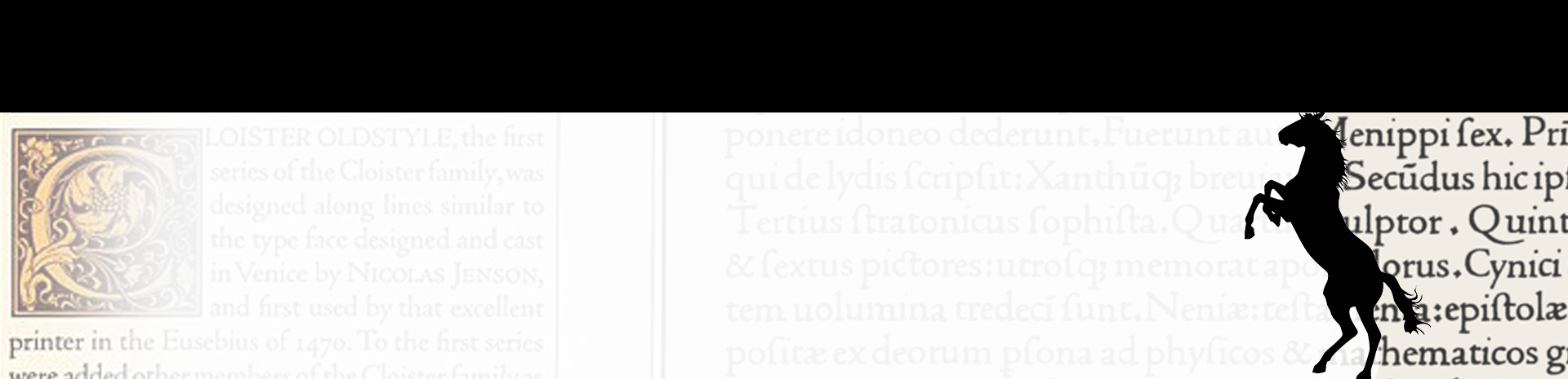
Horsepower
To the untrained eye, a serif is a serif is a serif. They all look like the letters you see in textbooks, novels, and newspapers. It is not until you study just how exquisite this typeface is can you appreciate its complexity. It is versatile. It is robust. It is timeless. It is elegant.
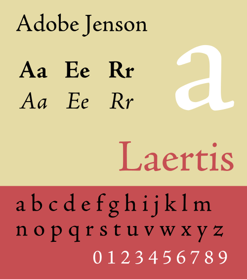
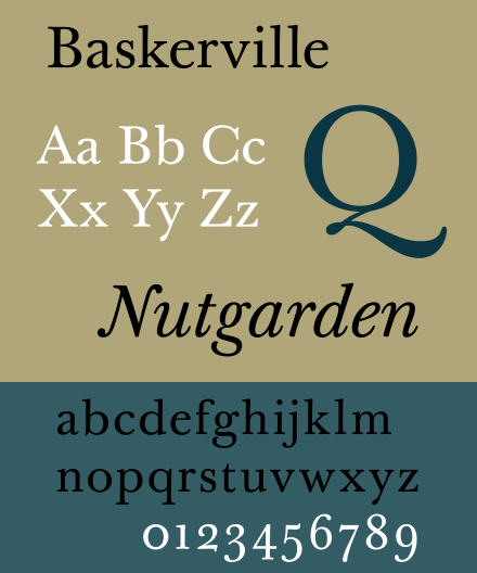
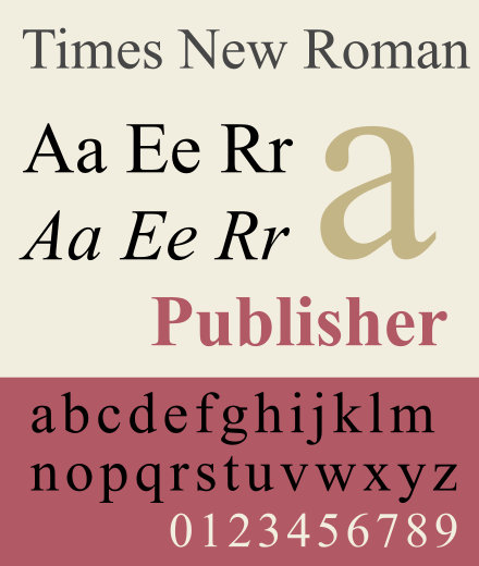
Enter Adobe Jenson Pro. This typeface has everything: every style you could ever want for any application (and it is my favorite serif face). It is, indeed, widely used in books and publications because it’s so dang readable. It has served as the model for many contemporary typefaces that you are familiar with, like Times New Roman (1931) and old-as-dirt Garamond (1495).
Saddle Up
This typeface is five. hundred. fifty. years. old. Designed so well, it remained virtually unchanged in digitization.
Jenson is older than dirt. Buckle up, kids, because that’s a lot of history to cover in a measly blog post. Columbus’ maps could have been typeset in Jenson when he sailed across the pond (they weren’t though, they were lettered in italic faces, probably by hand).
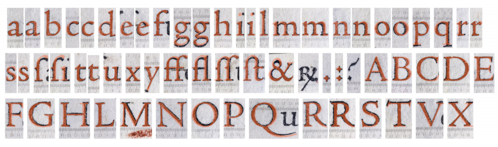
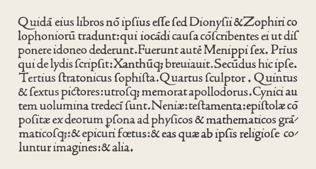
Created in c.1470 by a printer named Nicolas Jenson, this masterpiece came far ahead of its time. Ol’ Nick meticulously designed this metal typeface and reproduced it with impressively high-quality and consistency. His typeface, called Jenson 115R by scholars, was not copied from a previous face. There was no previous typeface it emulated; it was spankin’ new.
“The Jenson roman was a majestic step in advance, like if in 1984 Steve Jobs had released the Retina MacBook instead of the Machintosh 128k.”
Riccardo Olocco, PhD researcher at the University of Reading, faculty of Typography and Graphic Design, via e-mail
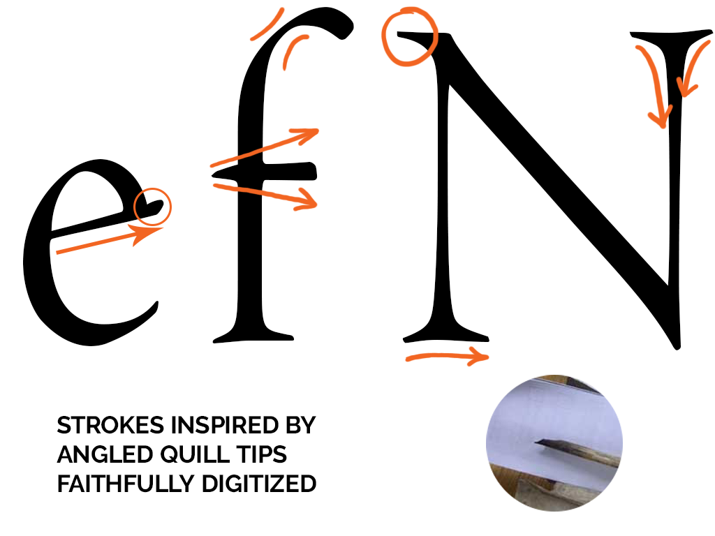
Jenson 115R is entirely designed for the reader’s comfort, and it was likely influenced by scribe’s handwriting (a specific style of script) from the time. Using a quill, these letters took on a calligraphic quality. It is supposed that Jenson 115R essentially accommodated handwriting in metal type.

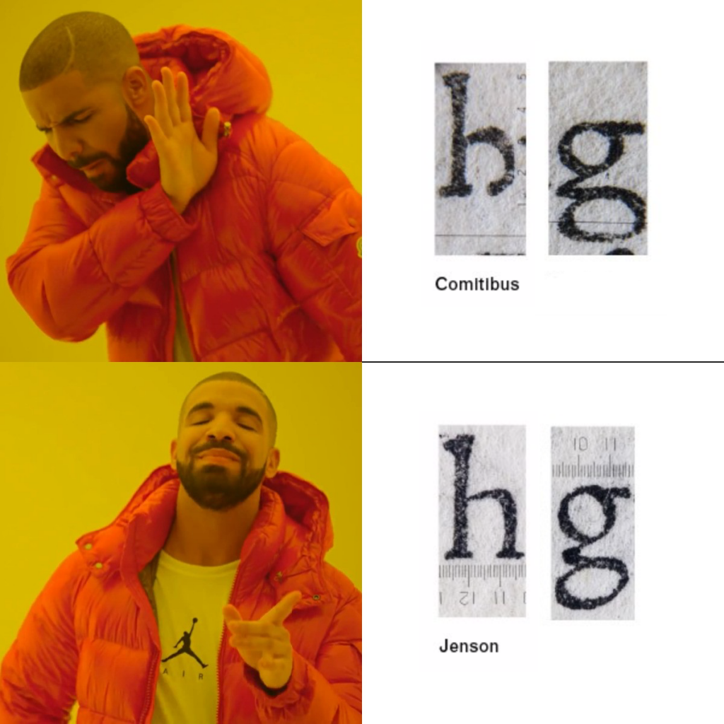
His buddies thought the new letter forms were an oddity because they were completely revolutionary. Jenson 115R became the prototype for all of today’s lowercase letters, and almost all of today’s serif faces. In fact, it was Jenson 115R that set the standard for what today’s g and h look like. See how the h used to look like a b with the bottom bitten out? And how the g is all disproportionate, like it flopped down on a couch?
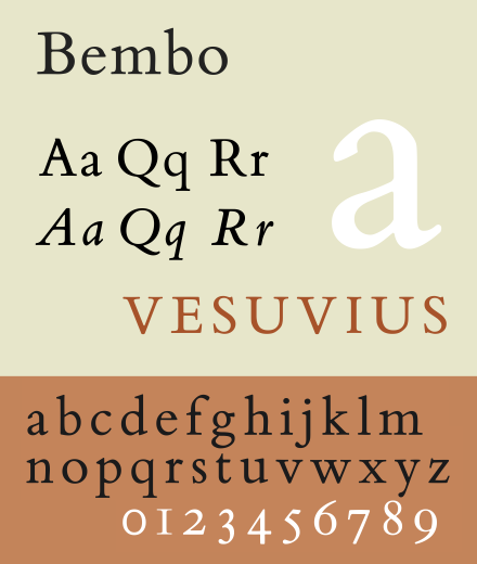
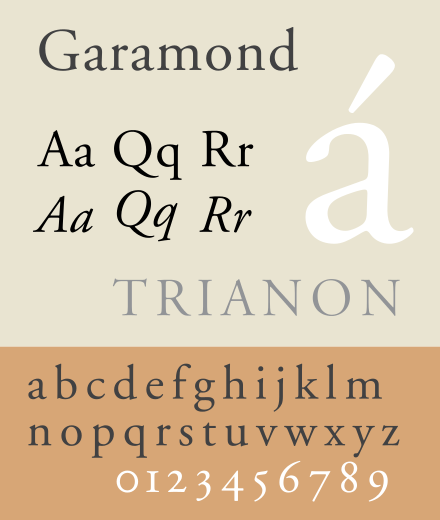
Tracking the evolution of this typeface is a tedious, daunting task; Jenson 115R itself was intensely copied, traded, sold, leased, imitated, and mutated for roughly the next three hundred years. There were even bootleg copies of it (lookin’ at you, di Pietro 114R). Garamond (1495) and Bembo (1495) show clear influence from Jenson 115R, not the least due in part to Francesco Griffo, an Italian typeface designer getting inky pinkies around the same time as Nick. Griffo was involved in the creation of both Garamond and Bembo, and created his own typefaces (namely, de Aetna, 1495) not too long after Jenson 115R saw great success. Jenson was, indeed, the subject of considerable hype.
“All the roman lowercase letters to this day have been designed on the same framework as Jenson’s.”*
Riccardo Olocco, The influence of Jenson on the design of romans. University of Reading.
*The so-called Modern Style, which appeared about 1800, had departed quite far from the Jenson model, even in skeletal forms.
The Sire
Not only did Jenson 115R get around, but also rumor has it that Ol’ Nick himself was a bit of a hound dog. His will left his buddy, Messer Jacobino de Rubeis, and his buddy’s wife, Petrexina, each a sum of money. Scholars speculate that Petrexina and Nick were romping in the sheets while Messer turned a blind eye to it all. Saucy.
But the typeface sired children. The first recorded “child” was found from 1472; it would be more accurate to call it a copycat. There are other somewhat contemporaneous typefaces using its influence (mentioned previously) as well as direct derivatives of Jenson 115R. A digital child of Jenson 115R, however, could be considered ITC Golden Type (1890).

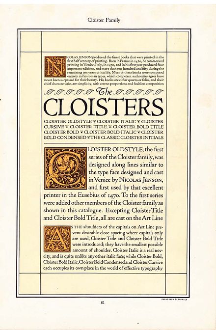
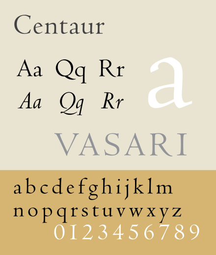
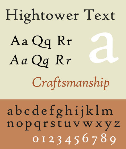
Other derivatives include typefaces you may not have heard of if you aren’t a designer, but let’s name names, shall we? Cloister (1913), Centaur (1914), and Hightower Text (1994) show clear stylistic links to Jenson 115R.
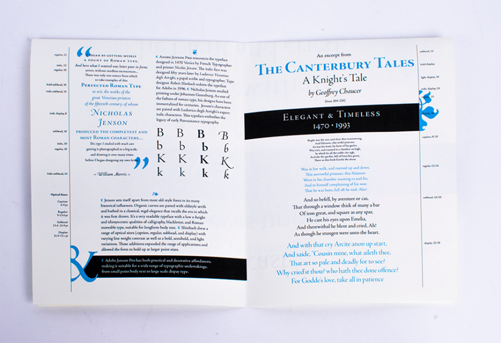
After a wimpy 526 years, type designers quit screwing around trying to mimic Jenson 115R and Adobe digitized a faithful version of it in 1996. Type designer Robert Slimbach added Caption (for captions, duh), Display (for titles and headlines), Bold (*angry face*), and Light (*happy face*) styles. Slimbach also digitized the Jenson 115R italic version, which already existed because it was developed by a separate Italian type designer fifty years after Jenson 115R hit the streets.
With the variations in weights, using this typeface today is easy. You’d likely see it in books. Aside from typesetting novels, this typeface conveys a sense of elegance, grace, and timelessness. Due to its calligraphic influence, I’d also argue that you’d use it to reference antiquity, wealth, longevity, and/or tradition (like a library, university, or law firm, for example). In fact, men’s fraternity Delta Upsilon (PDF warning) uses Adobe Jenson in their brand standards.

Compare

From the Horse’s Mouth
This article could not have been completed without the painstaking research and kindness of Riccardo Olocco, a PhD researcher at the University of Reading, faculty of Typography and Graphic Design.
The images of the original Jenson 115R typeface were from his article, The influence of Jenson on the design of romans. I cannot emphasize his importance to this article enough. Give his website, beautiful type designs, and his research (*below) a visit.
Read ’til Your Eyes Bleed
- Nicolas Jenson and the Success of his Roman Type*
- The Influence of Nicolas Jenson on the Design of Romans*
- The Jenson roman, its mutation, and spread, Journal of the Printing Historical Society. Winter 2018. (PDF warning)*
- Riccardo Olocco’s Micro Analysis of Jenson 115R (video)*
- Type Specimen of Adobe Jenson Pro (it’s pictures!)
- Adobe Jenson Release Notes (PDF warning)
Manure
Next week: I hate it so hard.