
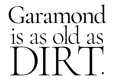
Type is probably my favorite part of design. Many are old as dirt and transformed with the times. Take Garamond, for example. This sucker was invented in the sixteenth century! Over time, type designers and foundries modified it to suit emerging printing technologies. It was used in the Gutenberg press and continues in its open-source digital forms today.
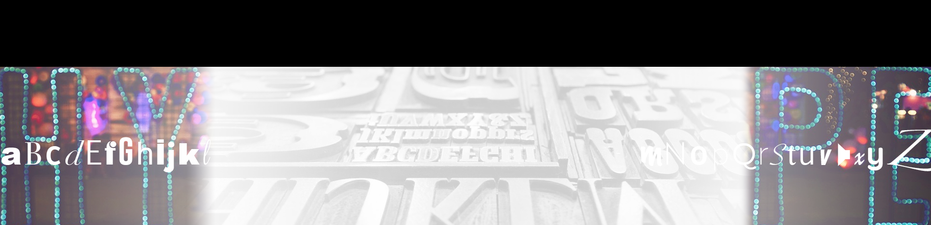
It is with this love for letters that I’ll begin a new series of blog posts, tagged Hypefaces. I’ll talk about popular (and unpopular) fonts, their histories, and resources where you can learn more. I’ll try to avoid overdone typefaces (like those below, plus Comic Sans and Papyrus. You’re welcome.). Maybe this series can help you select a typeface for your next design.
Potayto, Potahto
Let’s get one (pedantic) thing out of the way: Typeface is technically the correct word to describe the look and design of letters. “Futura” and “Garamond” and “Comic Sans” refer to the typefaces. It’s just the name given to the letters’ shapes.
Font is the entire collection of letters, numbers, punctuation, and glyphs of a typeface in a particular size (point size), weight (bold, light) and style (italic, light) of that typeface. When people say they want to change the font in Microsoft Word, generally speaking what they mean is they want to change the typeface.
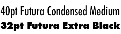
During the days of metal type, a single font would be referenced as 40pt Futura Condensed Medium because all of Futura’s characters in 40-point size, a condensed width, and medium weight would have been stored separately from those in the 32pt Futura Extra Black font.
Although this vocabulary is from the days of metal typesetting, today the words are synonymous. But we’re nerding out, so let’s continue. “Upper case” and “Lower case” letters refer to the physical location in the printing house: the capital letters were stored above the minuscule letters.
WTF: What the Font
Designing letters is meticulous and painstaking. Making them all work together to form, you know, words, is even more difficult because readers can tell nearly right away when a word’s letters are uneven, weirdly spaced, or different widths. Many typefaces still in use today were originally designed as carved wooden or cast metal type. Some, like Cooper Black, were invented because it made manual typesetting easier. A typesetter could hide his (and let’s be real here, they were nearly all men) mistakes in Cooper Black’s soft edges and round shapes.
Typefaces have interesting histories–which is why some typefaces are used in certain contexts but not others. Futura, for example, is nearly everywhere. Douglas Thomas and Ellen Lupton (one of my favorite type experts) wrote about its history as a corporate typeface, a sterile yet futuristic response to the typefaces preceding it, and why the Nazis used it:
Go to Helvetica, Arial.
There are others with controversial stories and use that spans the globe: namely, Helvetica and Arial. London Underground (England) and Lufthansa Airline (Germany) used Helvetica in their branding. Before Calibri, Microsoft’s default typeface was Arial.
If you’ve noticed similarities between Arial and Helvetica, that’s because Microsoft designed Arial to resemble Helvetica in an effort to avoid paying the licensing fees to include Helvetica on every Windows machine. Some die-hard designers and Apple aficionados find Arial distasteful for this (among other) reasons.
Helvetica is so common that there’s even a movie about it (and it throws shade at Arial):
Nerd Out with Me
And so begins this new series, Hypefaces. Next week, we’ll talk about a single typeface, its history and evolution, and where its use would be likely appropriate or seen today.
If you’d like to venture down a rabbit hole, none of these were sponsored recommendations but nonetheless books I voraciously consumed.