

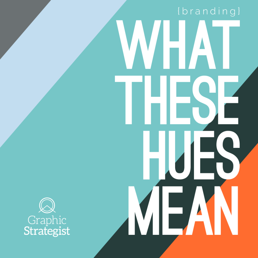

Color Theory
A close second behind typography, color is my favorite design topic. Color theory and the psychology of color are two old and broad fields in the visual arts. I won’t bore you with a history lesson, though (that’s what the Wikipedia links are for).
Let’s talk about why I chose the colors I did for Graphic Strategist.
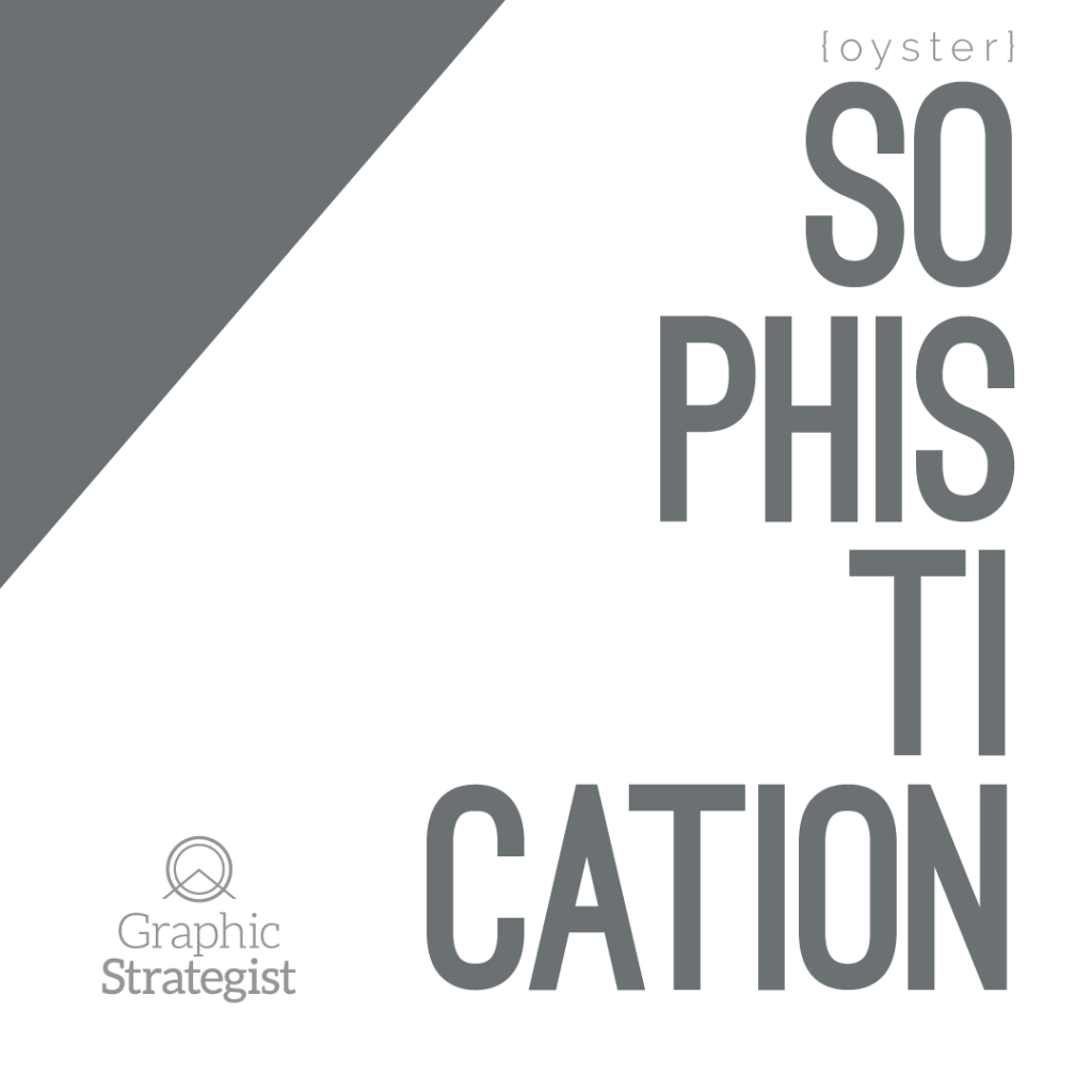
Oyster
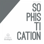
Gray is often seen as the color of compromise, of impartiality, and neutrality. These are qualities you’ll want in a vendor when developing or refreshing your company’s identity: a blank slate.
I chose (and LOVE) gray because it communicates understated elegance and a clam, approachable sophistication. It is conservative, refined, practical, and dignified.
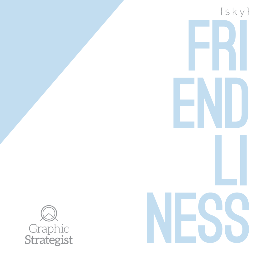
Sky
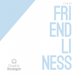
Blue is the color of trust (that’s why so many friggin‘ banks use it). Trust is the absolute bare minimum requirement in relationships.
I chose a lighter shade of blue instead of a rich navy because this shade is far more casual than deeper blue tones. While I take my work seriously, I am well aware I’m not over here curing cancer.
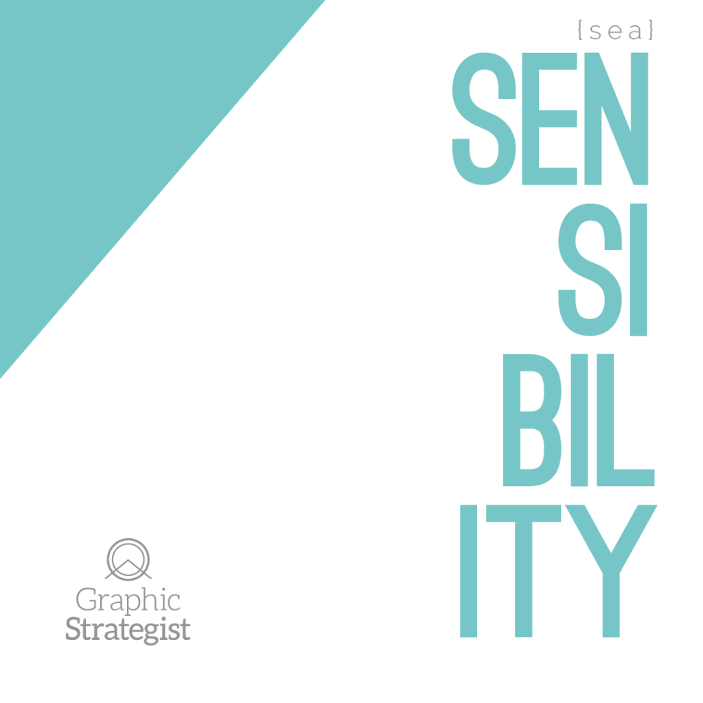
Sea
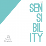
Ah, turquoise. Such a controversial color: is it blue, or is it green? It’s neither, and it’s both. Turquoise is linked to intuition and open communication. Put plainly: it’s the sensory experience. This is a leading color in my brand’s identity.
Indeed, branding is linked to all our senses, not just sight: the NBC chimes (Sonic Branding), the smell of an Abercrombie and Fitch store, the feel of New Balance shoes, and the taste of every McDonald’s hamburger everywhere.
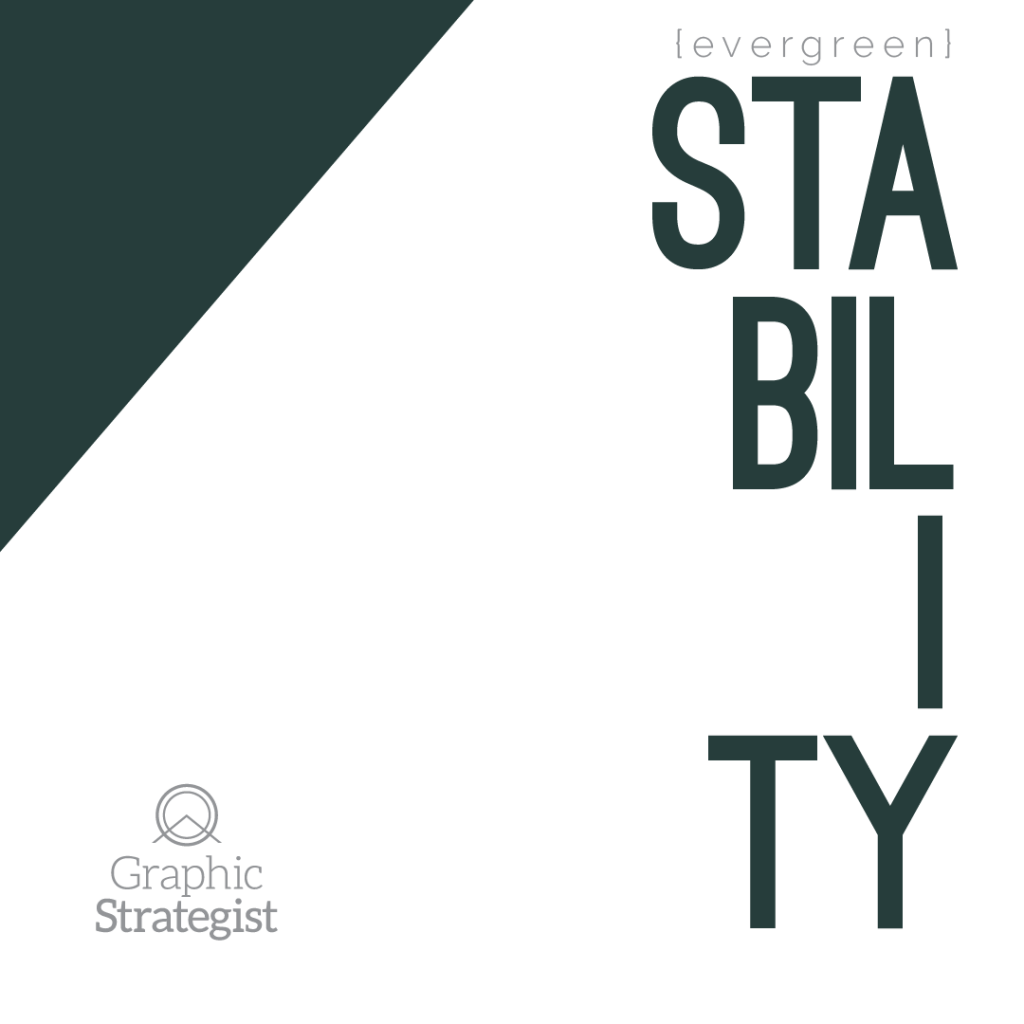
Evergreen

Deep, rich green: not as serious as black, not as fresh as spring leaves.
I chose hunter green for its association with harmony and balance; a well-grounded green that has staying power.
The Redwoods in California are evergreens. Who wouldn’t want a reputation for strength, durability, and longevity?
Sun
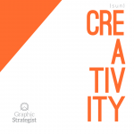
Who would I be foolin’ without a punch of color?
Orange is energetic; it conveys excitement and enthusiasm, curiosity and adventure. This is the other leading color in my identity.
Used in particular combinations, orange can look cheap and childish. Used sparingly, on its own, or paired appropriately, orange is a brand’s adventurous streak. The self-motivated. The risk-takers. The unafraid.
Conclusion
My palette, when understood collectively, represents interpretation. Working in visual arts requires a lot of judgement calls, intuition, agility, reflection, and mental stamina. There aren’t many decidedly black-or-white (or blue-or-green) decisions in developing a company’s identity. In both personal and professional circles, I am ready to leave my preconceptions at the door and listen between the lines.