A logo is your story in a single mark: the essence of your business, if you will. Some folks can get away with text-based logos. Other people need some sort of icon or visual cue to help them remember who the logo belongs to or what the business does. Not all logos need icons. Not all text-based logos are successful. It’s not my job to tell you what to choose, but it is my job to dig into the meat of your business, find out what you like, what’s already out there, then present you with well-informed and meaningful logos that you’ll enjoy using.
Let me illustrate (I swear that was the only pun!).
Imagine a business that says everything it does in the name: Pensacola Pressure Washing, for example. The words already say everything that needs to be said, so additional information might seem redundant or unnecessary. Sure, it’s a pretty generic name, but it’s an easy one to remember. It could be also argued that a highly-stylized or uniquely arranged text-based logo itself becomes an image to the brain; the brain no longer reads the letters for what they literally represent and instead sees a shape or a picture. A prime example of this is “Disney.”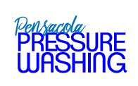
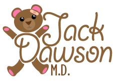
Now imagine a business with a person’s name or unclear mission, such as Jack Dawson, M.D., or UprightPro, Inc. Studies agree that imagery paired with text helps people with recognition and recall in memory tests. That’s why lots of logos include icons, imagery, or objects in place of or in addition to words. This approach makes sense in cases where names are forgotten, or what your business does or sells is ambiguous. In these cases, it would be prudent to consider imagery, icons, or some other visual cue for onlookers.