

This post is part of a series called Hypefaces, where we explore the history and evolution around popular (and not-so-popular) typefaces.
The TPS Report
I have such a visceral reaction to this typeface. I do not like it. I don’t know why. Perhaps it’s because I had to stare at the typeface all day every day in a job I loathed. Possibly it’s because I didn’t like the products in which it was released. Maybe it’s not the typeface’s fault at all.
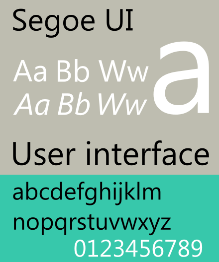
Segoe UI and Segoe, pronounced SEE-go, are the same typeface (look) but two different fonts (sets of characters). Microsoft introduced Segoe UI as the new user interface font in their 2006 bellyflop, Windows Vista, and they’ve used versions of Segoe UI in their Windows operating systems since then. Six years after said bellyflop, Microsoft’s corporate communications typeface became Segoe. For simplicity, we’ll refer to both Segoe UI and Segoe as just Segoe in this article.
And trust me, you’ve seen this typeface.
PC Load Letter?
Prepare to be confused. Although the name Segoe is a trademark of the Microsoft Corporation, the typeface was originally developed in 2000 by a privately held company named Monotype (who, if their name does not make it immediately obvious, only develops typefaces). Microsoft licensed it from Monotype in 2003 and released with Vista. Today, Microsoft holds the design patents in the United States to various Segoe-based fonts.

Microsoft made a BFD about Vista. They touted the brand-new user interface. They paraded the new font. Windows Vista was the subject of considerable hype, especially since the OS with worldwide reach changed so much between Windows XP and Vista.
“We’re not just introducing a new UI in Office 12–we’re also introducing a new UI font.”
Jensen Harris, lead fonts program manager for Microsoft Typography (his blog)
With the release of Vista and Segoe, Microsoft broke up with their old user interface font, Tahoma, after a 10-year relationship. They chose Segoe because it was readable and friendly even on the low-resolutions screens of the day (and it still is).
Once licensed, Microsoft expanded Segoe to include a script, a handwriting style, a true italic; a semilight, light, semibold, black, and black italic additions; and symbols. Variations of it were also used in two other MS Bellyflops®, the Zune, called Zegoe UI (so kitch); and the Windows Phone 7 (Segoe WP).
I believe you have my stapler.
Microsoft’s involvement with type controversy is nothing new. Most people are familiar with the Helvetica versus Arial story, but Microsoft ran into some hot water over Segoe, too.
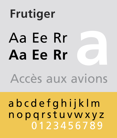
Linotype, a rival typeface company to Monotype, took quite the issue with Segoe in 2004 prior to the official release of Vista. Linotype released the typeface Frutiger Next in 2000, and argued that Microsoft ripped off Frutiger (Why go after Microsoft instead of Monotype? My guess is because Microsoft had the deeper pockets, making more money off operating systems than Monotype did off fonts).

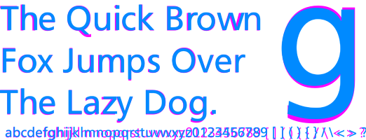
Segoe appears to be wider than Frutiger. Frutiger’s punctuation is square, Segoe’s is round. These differences are minute details, but you could argue that all typefaces are varying degrees of minute differences. Linotype argued that these details were changed only after their accusations were made public. Compare the typefaces. Blue is Frutiger, Pink is Segoe:
Microsoft and Linotype bickered about it for a while until Monotype–remember, who created Segoe and legally licensed it to Microsoft–was acquired by a private equity company in 2006. Then Monotype, with its new flush of cash, subsequently acquired Linotype. Linotype became a subsidiary of Monotype, and the whole argument was dead in the water. #MicDrop
Didn’t you get the memo?
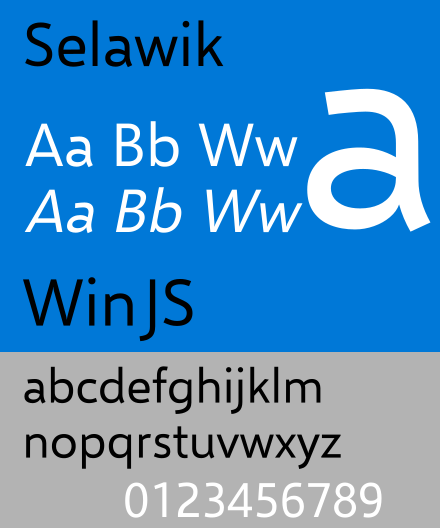
For whatever reason, Microsoft released Selawik as an open-source, “metric-compatible” replacement for Segoe in 2015. I don’t like it anymore than Segoe. But that doesn’t mean you shouldn’t. I’m not really sure what they meant by “replacement,” because Segoe and Segoe UI are still the official Microsoft and Windows typeface, respectively. If they meant “substitute,” “fallback,” or “comparable,” then that’s more understandable, but there is precious little information available about Selawik.

Computer geeks speculated that Selawik was released to a fix a spacing and weight issue in iOS and Android. The width and spacing of letters matters most to interface developers and interface designers, who may have had to to duplicate text (menus, tooltips, etc.) using Selawik in a space designed to fit Segoe. However, notes on Github say the letter spacing still doesn’t match.
Either way, the internet mostly shrugged it shoulders and went back to churning out cat videos.
A Case of the Mondays
Segoe is a humanist style with an industrial bent, removing any distracting qualities sometimes present in more traditional humanist typefaces. In a word, it is intentionally bland. If–in any typeface–you notice the letters before you read the words, someone somewhere made an error in type design choices.
Humanist faces are appropriate in many applications, but especially those involving direct contact with humans (duh). They often retain handwriting-like details.
Places where you’d see this typeface are typically customer-facing. Because of its casual appearance, it imparts approachability and friendliness.

Compare
Read ’til your Eyes Bleed
- Is the Microsoft Vista font just a copy?
- Designer says Vista Font is Original
- Making the Letters Better, Jensen Harris’s blog entry introducing Segoe (11/16/2005)
- Microsoft Release notes about Segoe UI
- Interview with Segoe designer
- I guess no one cares about fonts, Jensen Harris’s blog entry about the difference between Segoe, Segoe UI, and Frutiger (11/18/2005)
- A not-really-related but nonetheless interesting article about Typography for User Interfaces
Coming in on Saturday
Ok, but, this means war.