

This post is part of a series called Hypefaces, where we explore the history and evolution around popular (and not-so-popular) typefaces.
The Battle Plan
This typeface is the oldest in the world, lasting two millennia. Allow me to usher in this typeface by capturing what two decades into the second millennium has been like.
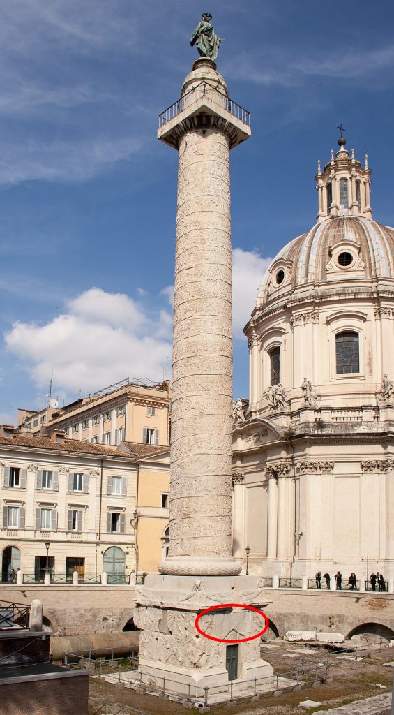
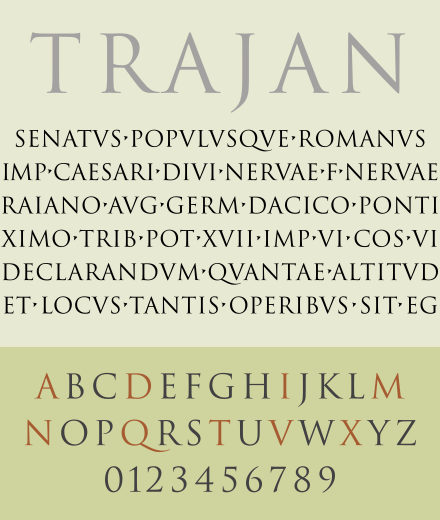
Trajan’s Column is a Roman triumphant war monument from about AD 110, give or take three years depending on who you ask. The column depicts a Roman emperor and military leader, Trajan, victorious over the Dacians (in modern Romania) over two different wars. This week’s font, Trajan Pro, was named after this emperor.
Historians aren’t sure if Trajan’s Column was commemorative or propaganda, but consider this: (1) it contains fewer than 20 scenes of the actual war, (2) contains over 60 scenes of Trajan himself, (2.5) originally had a statue of Trajan on top, and most importantly, (3) it’s impractical to read a comic strip that spirals up a marble column 115 feet into the sky. Regardless, the priceless monument is a document of ancient propaganda history.
Trajan Pro is based on the inscription on the pedestal of this monument. The inscription refers to Trajan’s massive effort to build public squares in Rome.

The Fearless Leader
Trajan, a man of quite the progressive social conscience for his time, wasn’t takin’ no BS from the neighboring king of Dacia. They fought a lot. Trajan would essentially pay the Dacian king to leave him alone, the king would chill out for a sec, get bored with the agreement, then lead a raid. The Dacians presented a threat to Rome’s autonomy and eventual expansion.
Trajan squashed that Dacian beef once and for all in AD 106 by simply burning their empire to the ground and driving the Dacian king to suicide. Then the best sculptors in the city (along with oxen and enslaved people) built Trajan a column for it and inscribed a sterilized version of events on the base. Neat.
War Veteran
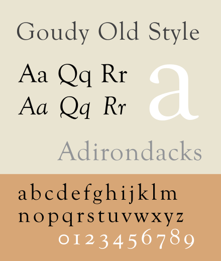
A handful of Trajan’s Column-based typefaces emerged, including Goudy Old Style in 1915. You can see, however, in Goudy Old Style that the letters have a more organic feel to them.
It wasn’t until 1989 when Carol Twombly digitized the font Trajan Pro that the rest of the alphabet was fleshed out (like letters W, U, J, and other newer letters). Twombly based her digitization on the work of Friar Edward Catich, who took rubbings of the inscription in 1970. A bibliophile on Twitter posted pictures of Catich’s rubbings last year:

As you can see, Twombly faithfully recreated the letters from Trajan’s Column. They look all crammed together in the rubbing above because the Romans didn’t use spaces, they either separated words with dots, called interpucts (•); or they just ran all the words together like lunatics.
Trajan appears on buildings worldwide, generally those bearing Greek Revival or Neoclassical architecture, and specifically government buildings in Washington, D.C.


Clash of the Titans
Alas, with the birth of the personal computer accelerating graphic design, the typeface exploded everywhere–and most notably, on movie posters. Hype ensues.
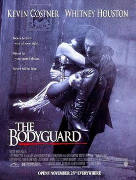
Before COVID-19 resigned us all to Netflix, we went to movie theaters (RIP 2019). To advertise their movies, studios created posters for the theaters. Massive blockbusters overtook this typeface in 1992 (The Bodyguard, for example) and 1993.
“It was originally used in epic movies,” graphic designer Yves Peters said during an interview with Vox, “movies about people overcoming difficulties.”
(Like…war?)
And man did designers lean in hard on Trajan Pro. Over time, it became the go-to typeface for film genres which didn’t really have a connection to the typeface’s source material: war victory.
“It’s become the typeface of the horror movies, B-movies, and also the straight-to-video ones.”
Yves Peters, Vox interview
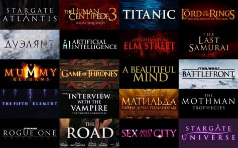
“A lot of the posters [in which Trajan Pro is used] are for the ‘lesser’ movies, that want to pretend that they are better than they actually are,” Peters continued in his interview as he described the proliferation of the posters using this font.
RETREAT
Although use of Trajan Pro fell off for several years, it appears as though it is making a small resurgence. Let’s review.
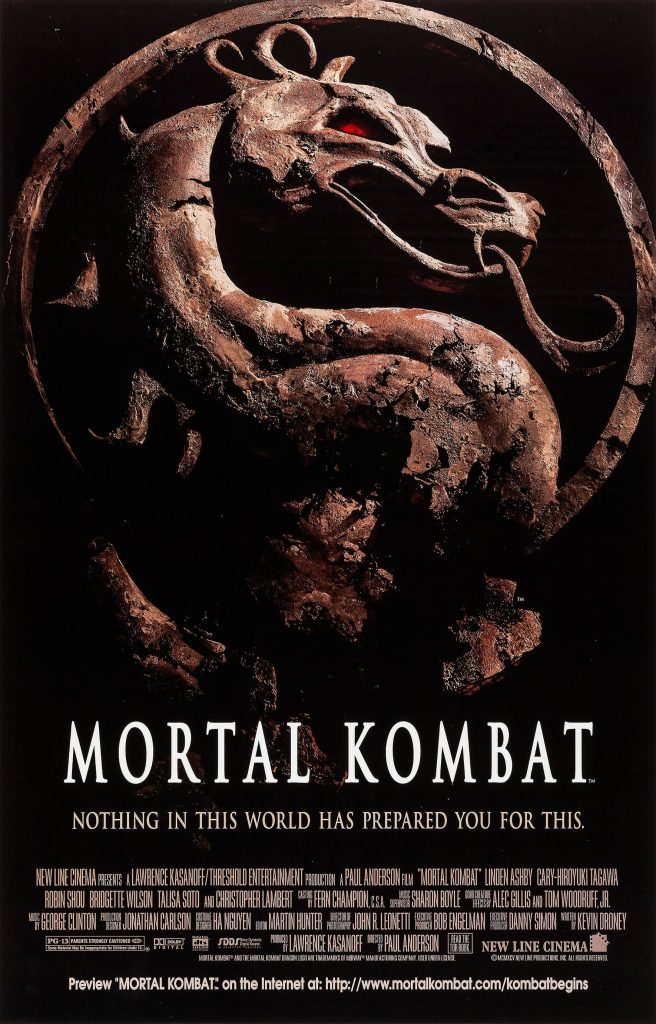
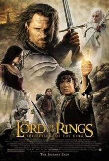
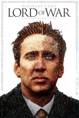
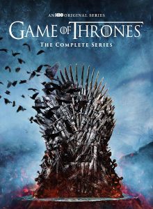
Where is Trajan Pro appropriate? Endurance. Stoicism. War. Battles. Epic stories. History. Literature about epic historical battles of endurance. I argue its use in the Star Wars series, Mortal Kombat, Lord of The Rings, Game of Thrones, October Sky–and similar battle-themed movies–were perfectly fine.
But…Message in a Bottle? Monster’s Ball? Sex and the City? The Human Centipede? Oh, come on. Trajan Pro, in my opinion, is not the typeface of luxury, love, and low-brow storytelling; but of conviction, violence, and victory.
Compare
Read ’til Your Eyes Bleed
- How one typeface took over movie posters (Vox, YouTube)
- Trajan’s Amazing Column (NatGeo)
- Reading an Ancient Comic Strip (Interactive Graphic, NatGeo) – P.S.: get ready to put your processor into overdrive
- Trajan, one of the Five Good Emperors of Rome
- Why Trajan, the World’s Oldest Typeface, Still Matters