

That may seem harsh, I understand. Some needed to hear it straight. Giving an in-person presentation has value for a reason: people are there for the person, not the slideshow.
Now that we’re ripped the band-aid off, let’s talk about why and how.
Why?
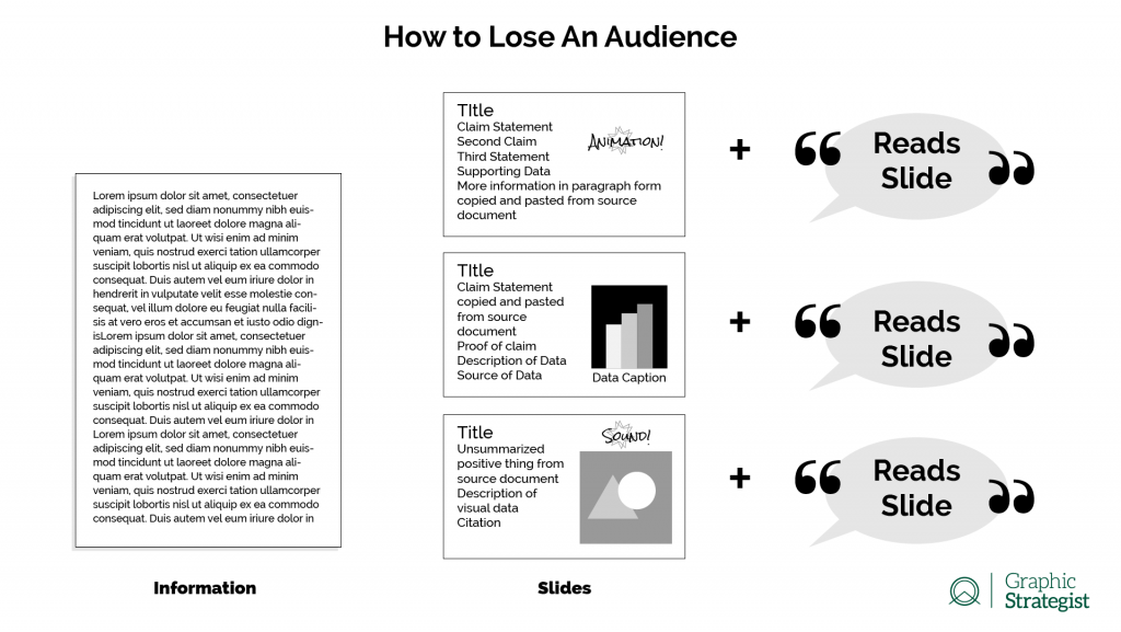
Case in point: You didn’t even read that graphic, did you? 😉
Information Overload
Too much information at once turns people off. The delivery feels disorganized and complicated, and people will eventually quit trying to figure out where to start (listen to you first? read the slide first? open the Facebook App and tune out the presentation completely?), what’s really important, where to expect information presented on each slide, and when to look at visual data.
Animations and sound can be used strategically, but overuse them and they become distractions. Use animations sparingly, and tasteful unobtrusive transitions. I would argue that sound effects are completely unnecessary, and that sound should be reserved for video or audio information.
You’ll lose them
When you put too many words on your slides, people will often stop listening to you and start reading your slides. This is especially true if they also realize you’re reading your own slides to them without delivering any new information.
Chances are, your audience will assume what is written on the slide is most important. And that should be the case. They may read and then listen, but by the time they stop reading, you’re probably almost done talking. However, as the old adage goes, “if everything is important, then nothing is important.” When you put on the slide every bit of information you think they need to know, what’s the point of a speech in the first place?
They’ll miss information
If you have too much information on your slides, either they will miss the important thing you said because they were reading, or they’ll miss the important thing on the slide because you were talking. They can’t focus on both at once.
How?
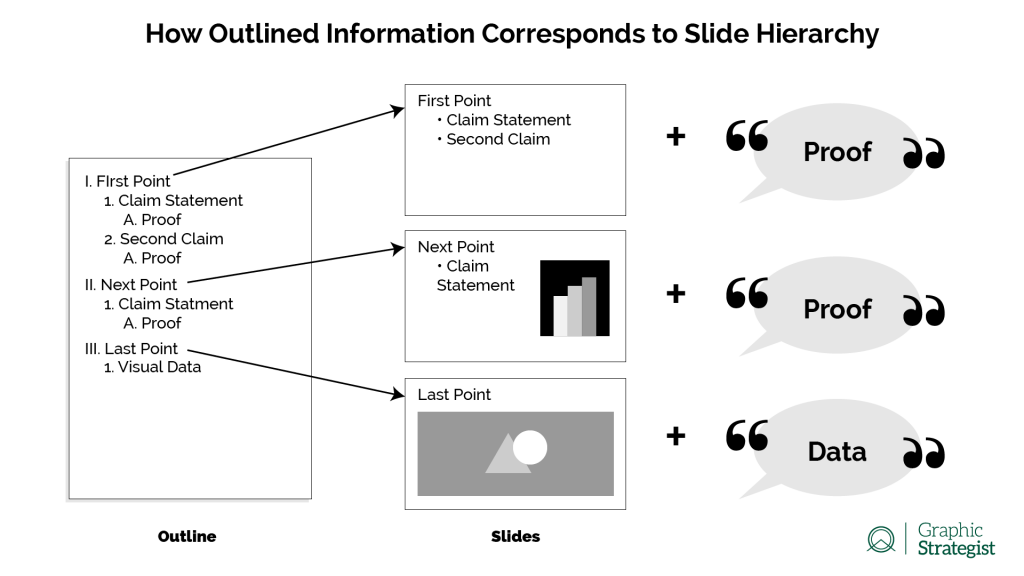
Start by deciding what information needs to be seen, and what information needs to be heard. Ask yourself: what is the number one thing my audience needs to take away from this slide?
Generally speaking, top-level information needs to be seen, and lower-level information needs to be heard. Yes, there can be exceptions, but resist the urge to make every slide or every presentation the exception.
Know Your Presentation
Rehearse, rehearse, rehearse. Rehearse your presentation in front of people. Even if it’s just a friend or spouse who has absolutely no vested interest in what you’re pitching. Being in front of an audience will get you comfortable looking at people instead of PowerPoints.
Make an outline of the points you want to make. Hit the high notes, then flesh it out from there. Know what you need to say to fill in the audience with your speech. A talking human is far more engaging than reading a PowerPoint.
Don’t Read Your Presentation
Reading your presentation to your audience offers nothing they couldn’t learn for themselves. If you are reading your slides to your audience, then you (1) have too much information on them, (2) are probably going to bore them, and/or (3) demonstrate you lack the confidence or knowledge to deliver your own pitch.
Visual Aid and Mental Cue
Slides should serve as a Visual Aid for your audience, and as a Mental Cue for you. Use the information on your slides to jog your memory about what you want to say. Slides should support your arguments with three to five short, bulleted snippets, 1 to 2 graphics, or a single video.
Arrange your presentations like you would an outline: Slide Titles are the I, II, and III of your outline: the top-level headings. Body text should be bulleted or numbered and is hierarchically lower information by only one–maybe two–levels. Grammatically complete sentences or full paragraphs should be spoken information.
Less is More
A strategic designer doesn’t make the information look “pretty,” a strategic designer makes the information look professional. A well-organized presentation makes for a much stronger impact than throwing at your audience all the information you have.
Keep your information tidy so you’re not regurgitating your visual cues. When you can, contact someone experienced in designing information. This is what a graphic strategist does. Panning for gold with a strategic designer helps you sift through the silt to get to the gold.