
The client wanted something “like the 30A logo,” which is a bit tricky. First, the 30A logo already exists. This logo does a good job of articulating the sights along State Route 30A: relentlessly sunny, expansive blue sky, and slivers of stratus clouds. In trying to understand what qualities about the 30A logo my client liked, I investigated both that […]
Tag: design
Categories
So I hear you like infographics….
…and here’s one about Destin! This one I made has been Liked and Re-pinned on Pinterest multiple times–and for good reason: it’s much more interesting to see data-heavy information when it’s put into an illustrated format. If you have a lot of data you’d like arranged in an interesting, readable way, consider an infographic. Infographics, or information graphics, take complex […]
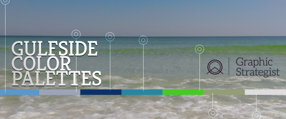
I see a lot of design inspired by the Emerald Coast. Many times, the color theme is turquoise paired with khaki and white. Just about every bridesmaid and brochure on the Gulf Coast has seen some flavor of this pairing. And in defense of this palette, they are obvious choices because they work! Tried and […]
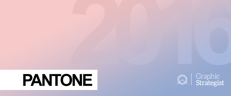
…are friggin’ Pink and Blue…?! Pantone, the “world-renowned authority on color” calls these colors Rose Quartz and Serenity. The nomenclature kind of reminds me of enthusiastic brides naming their wedding colors “A Candle at Midnight” when they really just mean “black and white.” I kid, I kid. With Rose Quartz and Serenity, you may at […]
Categories
About the Logo for Three H Medical
That’s a wrap! After exhaustive research, painstaking iterations, and countless cups of coffee, Three H Medical has a fancy new logo. Three H, headed up by US Veteran Jeff Wood, is a medical supplier specializing in Veterans’ needs. The strategy behind Three H’s logo focuses on Veterans: Old Glory’s stripes are three stylized letter Hs. […]